Get More Conversions From Your Website’s Homepage.
“Your homepage is for branded searches and business cards.”
I said that the other day in our blog about why you shouldn’t try to rank on Google for your website’s homepage. I further said “It’s job is to direct them to the right place where they will find the answer to their problem or question.” Here are three simple steps to help your homepage do its job.
Avoid Clutter
One of the biggest conversion killers on a homepage is clutter. There’s just too much information on the page because most people are trying to rank their homepage in Google search results. Finding the solution to your problem is like trying to find Waldo and his walking stick. People just don’t want to burn through that many calories to find out if you can help them.

Now that we know this tactic is not a good one we can get rid of the clutter. Here’s how:
Leave the navigation out of the header.
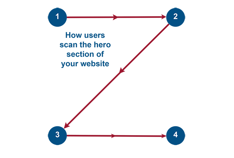
I know this is counterintuitive to everything you think you know about website design but it’s true. Navigation in the header causes an interruption to the Z pattern scanning of a website our brains naturally do to help us survive and thrive. It draws visitors away from your call to action and causes squirrel moments where the potential customer may never see your message before abandoning your website.
Highlight important messages.
Embolden or italicize words in the text or use headers to help people scan through your website’s homepage and see the important messages you want to send.
Use images.
Use images that portray success with your product or service or happy people doing happy things. The old adage “A picture is worth a thousand words” is true. Images help people picture themselves using your product or service. Use this to your advantage and use bright images to highlight your messaging.
Use short, easy to read sentences.
Use freshman in high school level vocabulary with short, easy to read sentences. Your content will have a better chance of being read. Large blocks of complicated text are difficult to write, difficult to read and, more importantly, difficult for your readers brain to scan. Make reading your website an easy task and stop asking your readers to burn unnecessary calories.
Call to action
Your call to action buttons are the most important thing on your website. DON’T HIDE THEM! The only outcome you’re looking for is for people to contact you and hire you or buy your product.
Make bold statements.
Don’t use wishy washy (I’d love to know where that came from…LOL!) statements like “Learn More” or “Find out More”. That’s too much work. Give people an action to take. Use bold statements like “Schedule a Call” or “Start Today”.
Make your call to action standout.
Like the language you use, the button itself should stand out. I’m not saying to use neon green, flashing buttons but be sure your buttons stand out from the rest of the content. Use contrasting colors and bold text. You should also use an arrow or caret to ‘show the way’ forward.
Give them a plan.
Most people are like the Russians, they don’t take a dump without a plan. Provide people with a plan and show them how to work with you.
Give them 3 steps.
People like plans but they like really easy plans better. Don’t complicate this. Give them the 30,000 foot overview of how to work with you. Make the language simple and unintimidating. Below is an example from our website’s homepage:
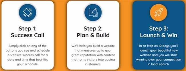
Show them how ‘easy’ is is to work with you.
Remove obstacles and objections by showing potential customers how easy your process is. Use light language and avoid words like ‘work’. Give people an easy path to follow and they’ll follow it.
Using these three steps you’ll make your website easier to read, you’ll give people a clearly defined and easy plan and you’ll show them how to get started.
Easy Peasy!
These are just 3 simple steps to get more conversions from your website’s homepage. There is more to do but. if you start with these three, you’ll be well on your way to homepage success.


